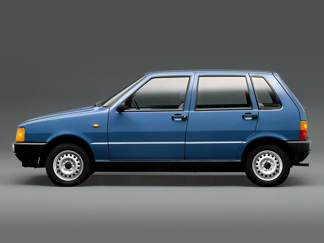
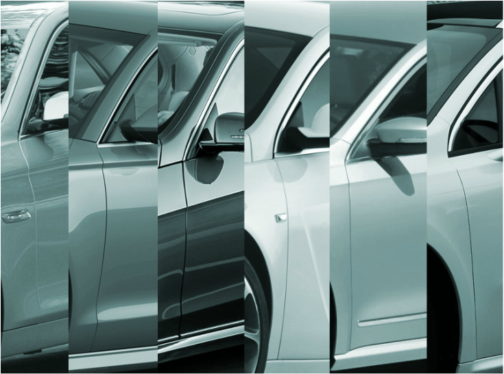
Cars are the sculptures of our everyday lives. For me, they are fascinating objects: I love the way in which sheet metal can turn light into a liquid, play with it, and let it run off. Every time I walk by a row of parked cars, I force myself to look beyond the color of the metal and see only light, dark, and the millions of increments in between. Even on the most mundane of car bodies, the surfaces are meticulously controlled – it is not easy to make light do your bidding.
0 Comments
The 1985 Ferrari Testarossa is a car design icon. This is not a contentious statement: unlike my column last week extolling the virtues of the FIAT Ritmo, I am not being deliberately provocative when I say the Testarossa was an important design. However, I think the Testarossa is written off by many car design enthusiasts as one of the flamboyant excesses of the 1980s. Worse still, the car is often reduced to the five iconic strakes that grace its flanks, as if they were the only reason the Testarossa became famous. Like any iconic element that fixes itself in the popular consciousness, there is a tendency to overlook its technical function and oversimplify its artistic merits. For me, the strakes are an interesting contribution to an artistic debate that has been going on since the early years of the 20th century: the graphic representation of speed.
For my 2015 new year’s resolution, I have resolved to be more brave: I will admit in writing that I like the FIAT Ritmo. I understand that this is not necessarily a popular position because the Ritmo most of us have in our collective memory is a dusty, sun-bleached rust-bucket. Furthermore, it is likely that our recollection of the Ritmo has been clouded by two unfortunate facelifts (1982 and 1985), which weakened the original design considerably. That is why I want to be very specific: I am fascinated by the shiny new compact car that graced the FIAT stand at the 1978 Turin Automotive Show.
This column first appeared on January 13th, 2015 on Autoblog España. When writing an opinion column on cars, leading off with a piece on the A-pillar might seem counterintuitive. After all, the A-pillar is easily overlooked and often forgotten in car design criticism. This, however, is precisely why it interests me: I have spent years examining iconic pieces of design, yet I have always found the unremarkable worthy of closer study. I am fascinated by the cornice of a building, the frame of a famous painting, and the violas in a symphony.
I am fascinated by the A-pillar because I have never once said, “What a beautiful A-pillar! I have never seen its shape before!” Why not? Why should an A-Pillar not be dramatic, fascinating, and artful? Dear Architects: You keep using that word: Origami, and as Inigo Montoya would say, I do not think it means what you think it means. As an Origami folder with a passion for architecture, I want to set the record straight. And for all you would-be architectural origamists, I have developed the innovative Bangle Test to help you self-diagnose whether your project actually deserves the title: Origami.
Servant and served space is an concept used in architectural theory and planning. Simply put, it is this:
Servant space is the framework of utilitarian spaces that connects, frames, and enables the served space to perform its programmatic duties. A servant space may be a corridor, a staircase, an alcove, a storeroom, a bathroom, mechanical room or a similar secondary space. |